The font is the voice of a memorial. People obsess over the shape of the stone and the symbol in the corner, then pick the lettering in thirty seconds – which is backwards, because the font is the part you actually read, the part that carries the name across a century of weather. Headstone fonts are not decoration. They are legibility, dignity, and tone, all at once, and the right one can make a simple flat marker feel timeless while the wrong one makes an expensive upright look like a billboard.
So this is about the lettering. Which styles last, which ones fade into mush after twenty winters, how the font has to suit the stone and the carving method, and how to see it before you commit. Practical stuff, mostly, from people who cut these letters into granite for a living.
We set thousands of markers a year at Memory Headstones, and if I had to name the single most underthought decision families make, it is the font. Let us fix that.
What headstone fonts actually have to do
A font on a screen and a font in stone are two different animals.
Headstone fonts have a harder job than any lettering on a poster or a page. They have to be carved – sandblasted or laser-etched into hard granite – and then they have to survive rain, frost, lichen, and a hundred years of sun without the strokes filling in or wearing away. That rules out a lot of pretty typefaces straight off. Anything too thin loses its hairlines to weathering. Anything too ornate clogs with grime in the grooves and turns to a smudge from ten feet away. The headstone fonts that work are the ones built to be read at a distance, in raking light, by someone who never met the person. Legibility first. Beauty second, and beauty almost always follows legibility anyway.
That is the quiet rule of this whole craft. If you cannot read it from the path, it failed, no matter how lovely it looked on the proof.
Choosing the right headstone font for the stone and the carving
The font is not a free choice. The stone and the method vote too.
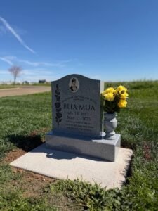
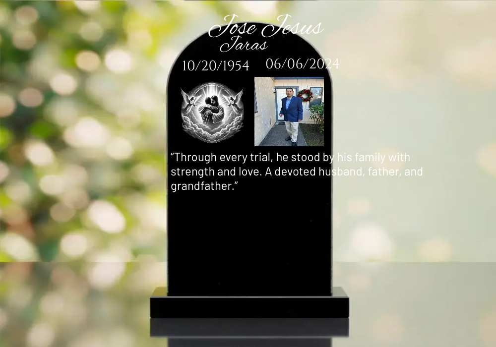
A headstone font that looks perfect in a roman serif on dark Indian Black granite can disappear on a busy speckled grey. A delicate script that sandblasts cleanly might break up under laser etching, or the reverse. So picking a headstone font means thinking about three things at once – the granite color and how much contrast it gives, whether the lettering is sandblasted deep or laser-etched fine, and the size of the stone the words have to fit. Block capitals carry a long surname across a wide flat marker beautifully. A flowing script suits a single first name and a short verse, but crammed onto a small child’s marker it can lose its grace. We match the headstone font to the physical reality of the carving every time, because a font chosen in the abstract often fights the stone once it is cut.
Honestly, this is the part families never expect – that the lettering and the rock are in a kind of negotiation. Get it right and they sing together.
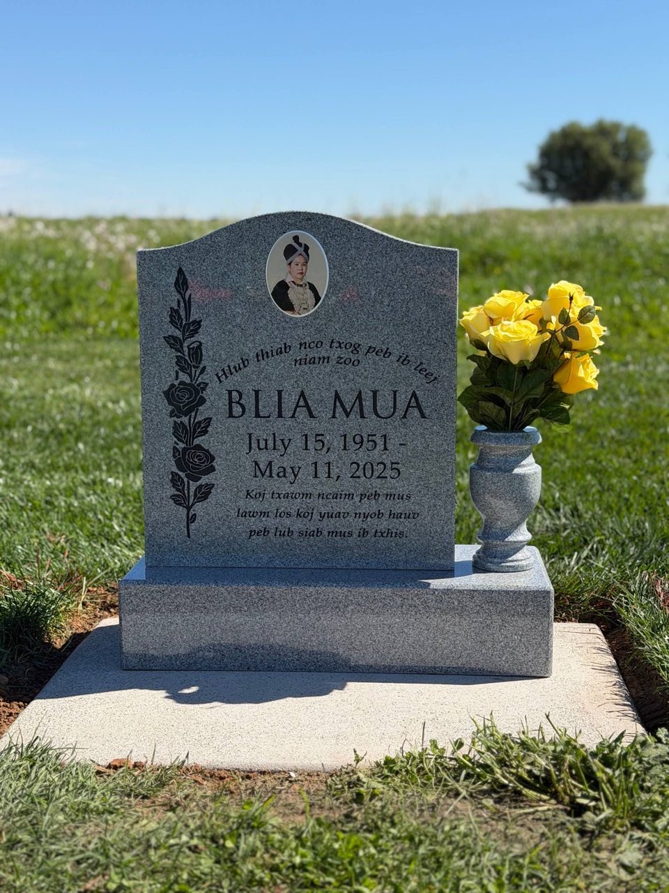
The best fonts for headstones and why the classics endure
There is a reason you see the same handful of typefaces in every old cemetery.
The best fonts for headstones tend to be the time-tested ones – a clean roman serif, a classic Times-style face, a dignified sans-serif, a restrained formal script for those who want a softer feel. These endure because they were designed for clarity and they carve well, the strokes thick enough to hold up, the forms open enough to stay readable when grime settles in. When families ask us for the best fonts for headstones, we steer toward these not out of conservatism but because we have watched the trendy ones age badly – a fashionable display font from twenty years ago can look dated and hard to read now, while a good serif from a century ago still reads clean. Trends fade. A name has to last longer than a trend.
That said, the classics are not boring. A well-set roman serif in crisp white-painted lettering on black granite is one of the most beautiful things we produce, and it never once looked like a compromise.
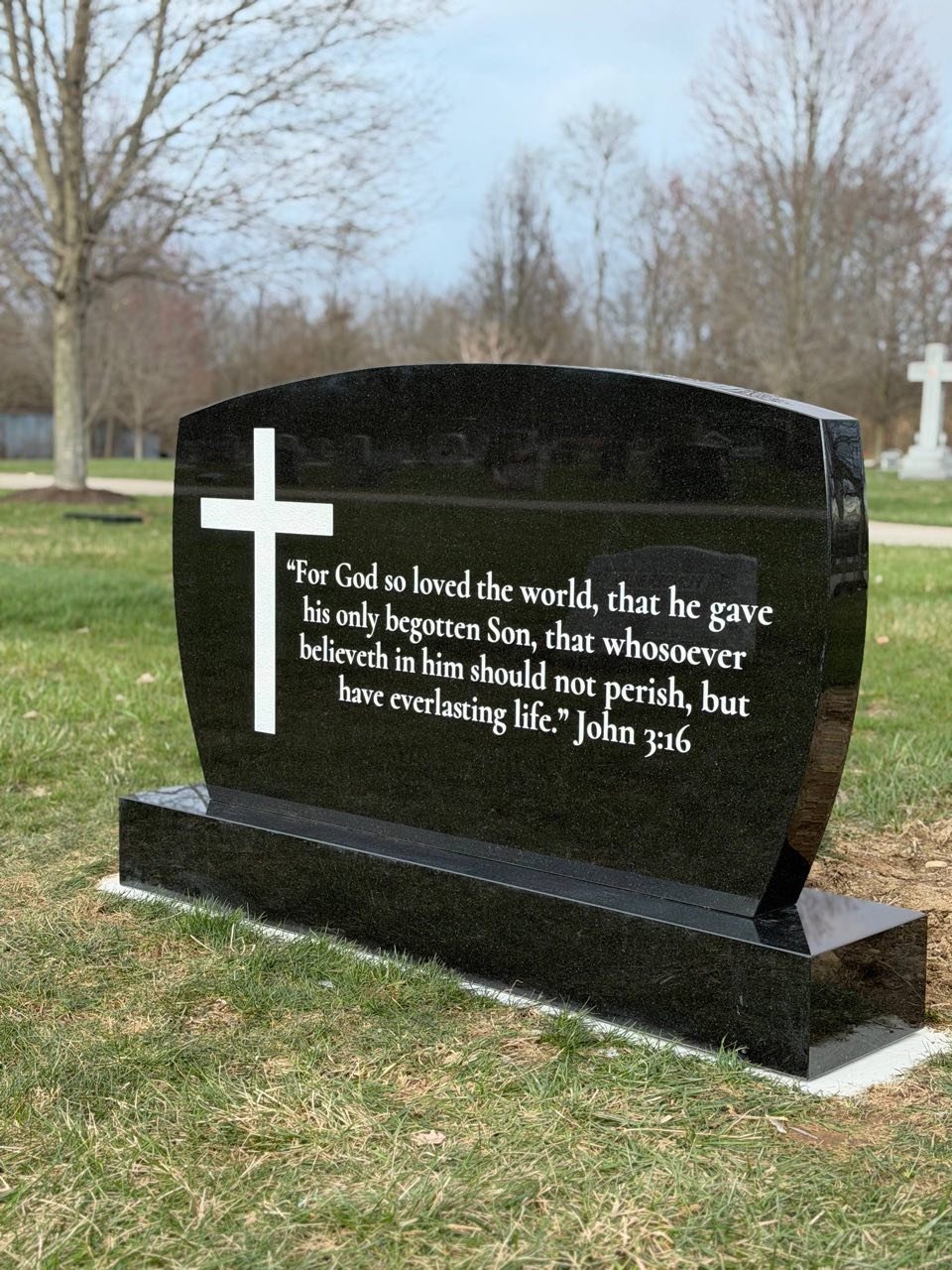
How a serif or sans-serif headstone font changes the whole feeling
Small choice, big difference in tone.
A serif headstone font – the kind with the little feet on the letters – reads as traditional, warm, slightly formal, the look most people picture when they imagine a memorial. A sans-serif font, clean and without the feet, feels modern, quiet, understated, and has grown popular with families who find the traditional styles too ornate. Neither is better. They set a different mood, the way a hymn and a folk song can both be the right music depending on the person. We have cut sans-serif markers for engineers and artists who wanted something spare and contemporary, and rich serif lettering for grandparents whose families wanted the timeless, churchyard feel. The font carries the personality before a single word of the epitaph is read. So choose the one that sounds like them, not the one that is trending.
Mixing fonts and where families go wrong
One stone, too many voices. It is the most common mistake we see.
A marker can carry more than one font – a formal script for the name, a clean serif for the dates and verse, say – and done with restraint it looks elegant. Done without restraint it looks chaotic. The rule we give families is simple: two fonts maximum, and let one clearly lead. The name in the statement font, everything else in a quiet supporting one. When people bring us a design with four different typefaces because they liked all of them, we gently pull it back, because a headstone crowded with competing lettering reads as busy and loses the dignity that the simplicity would have given it. Less is almost always more here. The strongest markers usually use one font, beautifully set.
Reading real headstone font examples before you decide
A font name on a list tells you nothing. You have to see it in stone.
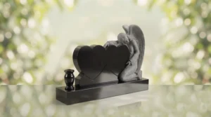
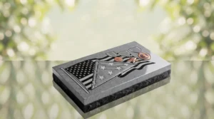
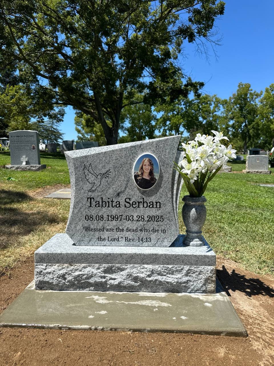
This is why headstone font examples matter so much – the same typeface looks completely different sandblasted deep into black granite versus laser-etched on grey, at three inches tall versus one. Looking at real headstone font examples on finished markers, not just a dropdown menu of names, is the only honest way to choose. A script that looks elegant in a small specimen can feel overwrought at full size; a sturdy serif that looks plain on screen can feel quietly perfect once it is carved and catching the light. We show families actual examples – real lettering on real stone – precisely because the leap from screen to granite surprises people every time.
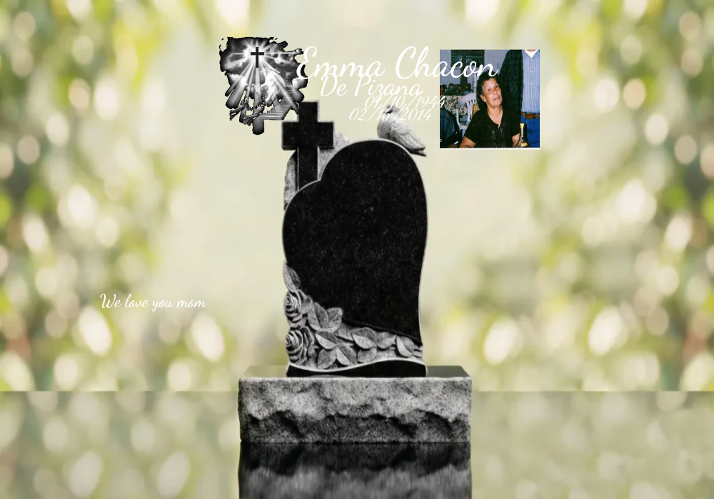
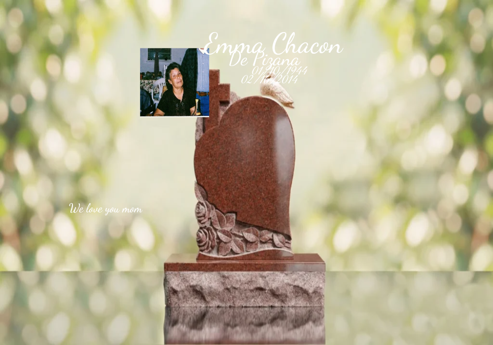
And now you do not have to imagine it. On our product pages you can set the name in different fonts for headstones, see it rendered in 3D on the actual stone, then use the AR preview to stand the marker at full size on the grave through your phone. The lettering, at the real scale, in the real place, before anything is cut. That single feature has ended more font second-guessing than any specimen book we ever handed across a counter.
Letter size and spacing matter as much as the font itself
The typeface gets all the attention, but the spacing is where amateurs and professionals part ways.
Even the best font fails if the letters are crammed or floating. A name needs air around it – margins, a little silence top and bottom – or it reads as cramped no matter how good the lettering is. Letters set too tight blur together from a distance; set too loose they stop reading as a single word. The size matters too: lettering has to be cut deep enough and large enough to stay legible once weathering softens the edges, which is why we size the name to the stone rather than just filling the space. A roman serif at the right size with generous spacing on black granite will outread a fancier font jammed in tight, every time. Spacing is the invisible half of good headstone lettering, and it is the part we sweat over on every proof.
Practical font notes families ask about
The small stuff that trips people up.
Long names need a font that stays readable when shrunk to fit – block capitals or a clean serif, not a delicate script that turns to spaghetti at small sizes. Multiple languages or non-Latin scripts – tell us, because Hebrew, Arabic, Cyrillic, and Asian characters each need lettering cut by someone who knows the tradition, and we do that work. Faded old markers – if you are matching a font on an existing family stone for a companion piece, bring us a clear photo and we will match the lettering style so the two read as a pair. And the painted-versus-natural choice – white-painted letters on dark granite give the sharpest contrast and the easiest reading, which is why so many families choose it.
We help families with all of this across California, Texas, Florida, New York, Pennsylvania, Ohio, Illinois, North Carolina, South Carolina, New Jersey, Washington, Oklahoma, Kansas, and Arkansas, with showrooms from Sacramento and Los Angeles to Houston, Tulsa, Edmond, Plainfield, and Galloway, and full cemetery coordination and installation wherever you are. Veterans receive 30% off with full payment, police officers and first responders 25%, and in-house financing means the lettering you want is never the thing you have to compromise on.
The thing I keep coming back to, after years of cutting names into stone, is that the font is the closest a memorial gets to a human voice. Choose it the way you would choose how to say the name out loud – softly, or formally, or plainly, depending on who they were. Get that right and a stranger a century from now will read it and, just for a second, hear them.